Loom Recorders
Creating a simpler, more focused recording flow to improve creator confidence
my Role
Design Manager
My Scope
Design Management
Operations and Execution
Milestone Planning
Resource Management
Team
1 Product Manager
3 Designers
1 User Researcher
1 Data Scientist
3 Engineers
Timeline
10 Months (Chrome)
1 Year (Desktop)

The information architecture of Loom’s recorders hadn’t been updated in years, leading to a bloated and outdated interface.
When we found out that our engineers were going to have to rebuild the Chrome recorder from the ground up to accommodate new security guidelines, I worked with my Product Manager to develop and prioritize a strategy for redesigning the experience.
To hit the deadline and ensure metric improvement, we first designed and launched a new Chrome recorder experience, then followed with updating the front-end of the desktop recorder for a unified recording experience.
Loom Creators experience many barriers to recording that can make the process time consuming or impractical.
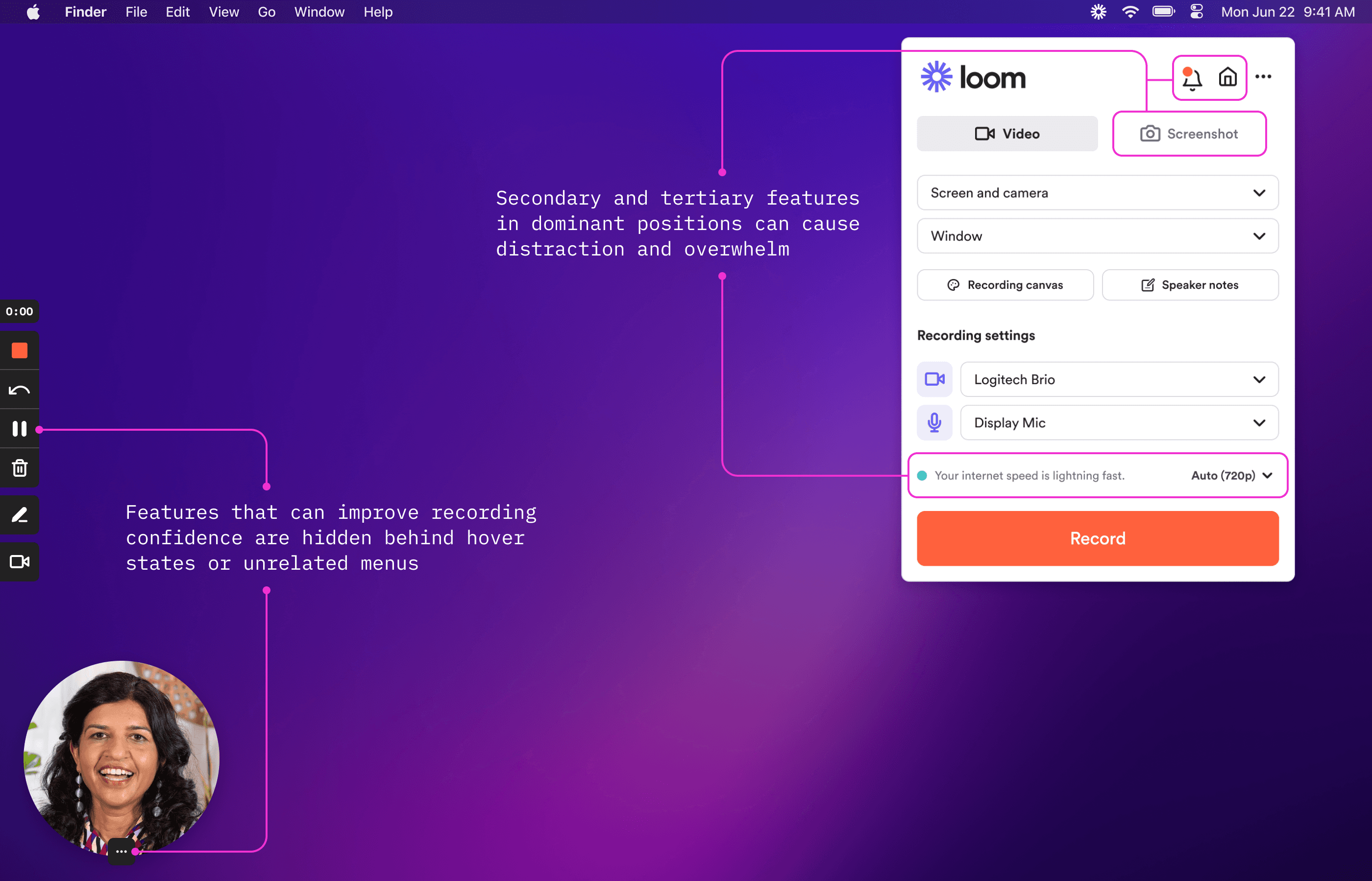
Core recording features like audio and video inputs were hard to find, and features that could help create a successful recording like the pause button went entirely unnoticed. This led to a major drop off between opening the recorder and sharing a completed video.

The biggest opportunities laid within removing noise in the UI and reducing the number of decisions that need to be made.
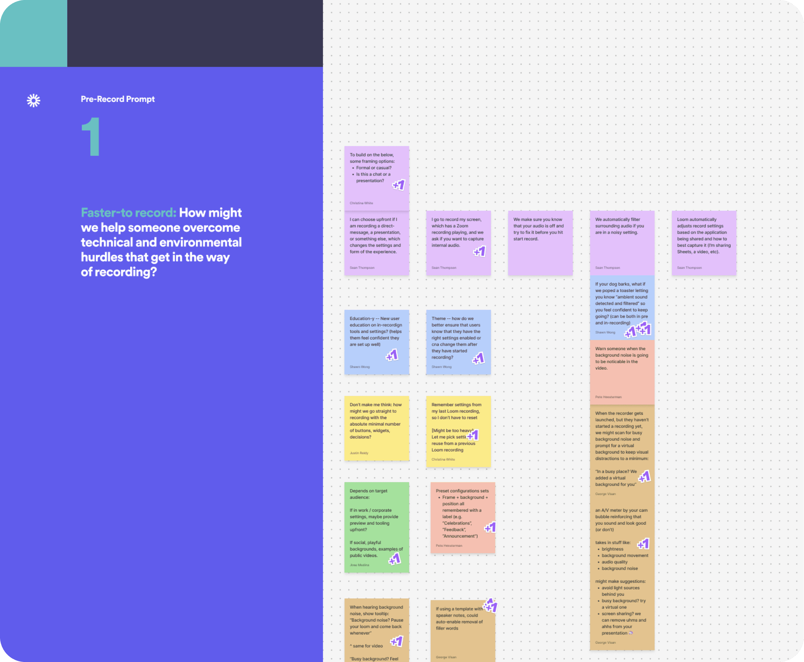
The designers ran a collaborative brainstorm session focused on how we can help someone overcome technical and environmental hurdles that get in the way of recording, or overcome stage fright.
A few key themes emerged that helped drive the design explorations:
Opinionated interfaces
Automatic adjustments
Supportive tooling
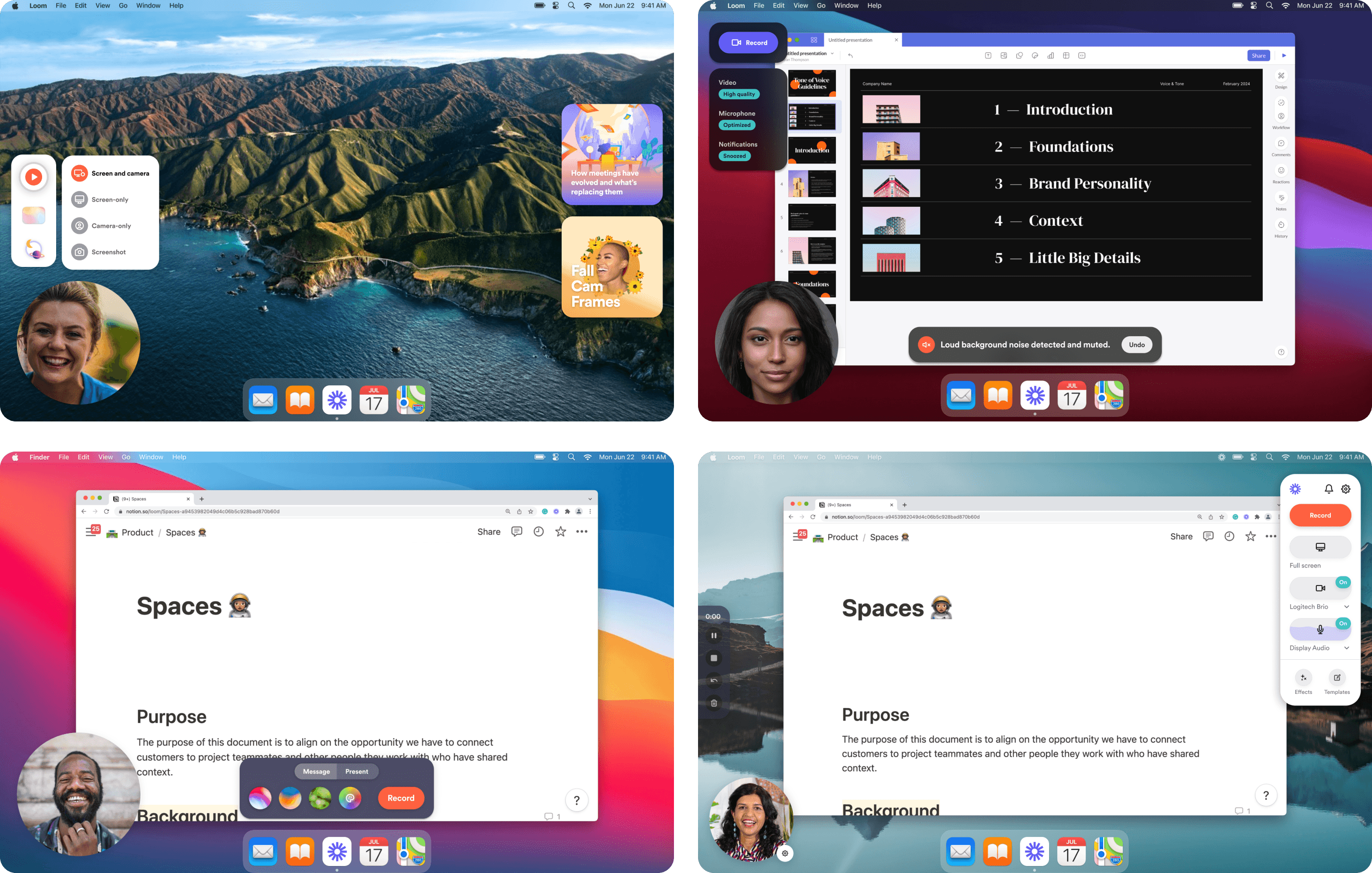
Concept testing with users early on taught us that simpler is better, but too simple UI can lead to a lack of confidence.
Working with our user researcher, a variety of divergent concepts were tested, from completely removing set up and taking care of it automatically, to making recording a video feel like they’re playing in FigJam.
Ultimately, users were most confident using a simple checklist-style set up, combined with the familiarity of our traditional recording menu.

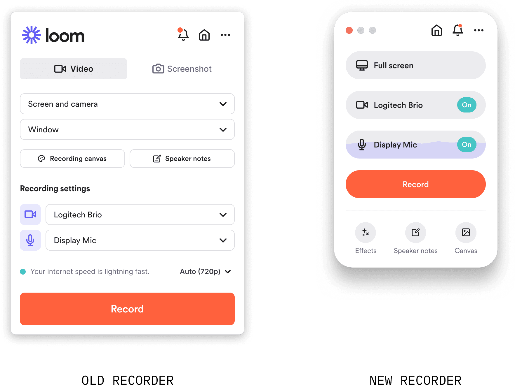
A simpler capture mode brings core settings front and center
One of user’s top concerns is that many core features were hard to find or notice, particularly the camera and microphone settings.
The new interface was designed to act as a checklist for only the most important settings: the screen, the camera, and the microphone. This way users can quickly 1-2-3 check! before hitting record. All of Loom’s supplementary expression tools are now appropriately secondary beneath.
Better surfacing recovery features led to more successful recordings
One of the biggest pain points for Loom’s creators is that they think they have to get their recording perfect in a single take. By enlarging the control menu and showing pause in its collapsed state, in-record optionality is now easier and more discoverable to use.
This increased the use of the tool by 14% which led to 3.2% more videos being viewed.


Invisible Speaker Notes increase creator confidence
Around 42% of users experience mental barriers around perfecting their speech. During the larger rebuild, I led the design for Speaker Notes, which reduces this burden, creating a place to prep talking points or a script to reference while recording. This helps creators record more effectively and confidently, especially in high-stakes situations, resulting in more successful recordings.
Chrome Extension Results
video first view
(North star metric)
completed recordings
new user activation
paid conversion
Desktop App Results
video first view
(North star metric)
new user activation
pause clicks